How do you want your space to feel?
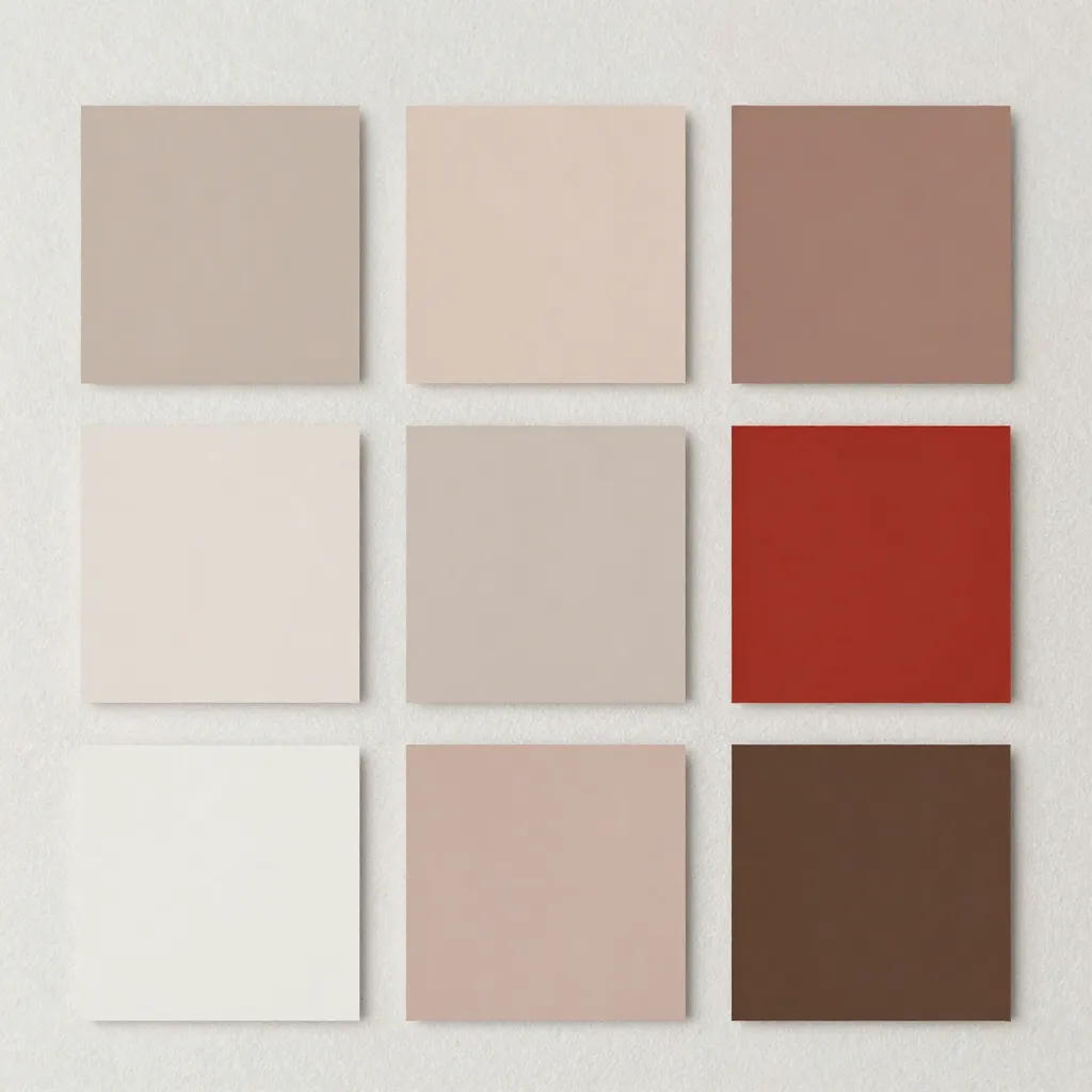
Balanced Harmony
A sophisticated equilibrium between energy and tranquility.
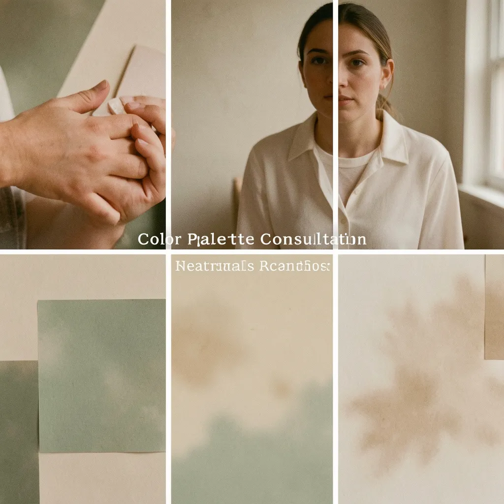
Experience the transformative power of color. Our consultation service identifies the optimal color palettes that align with your personal brand or home environment, creating atmospheres that resonate with intention.
Engineering Atmospheres Through Color
Color is not merely decorative—it is a fundamental element that shapes perception, influences mood, and communicates identity. Our methodology combines scientific understanding of color psychology with aesthetic precision to deliver palettes that function as intended.
Consultation Services
Personal Branding
Develop a cohesive color identity that reflects your professional presence and communicates your values effectively across all touchpoints.
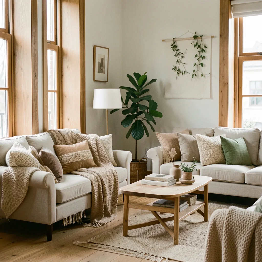
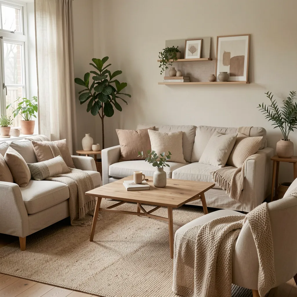
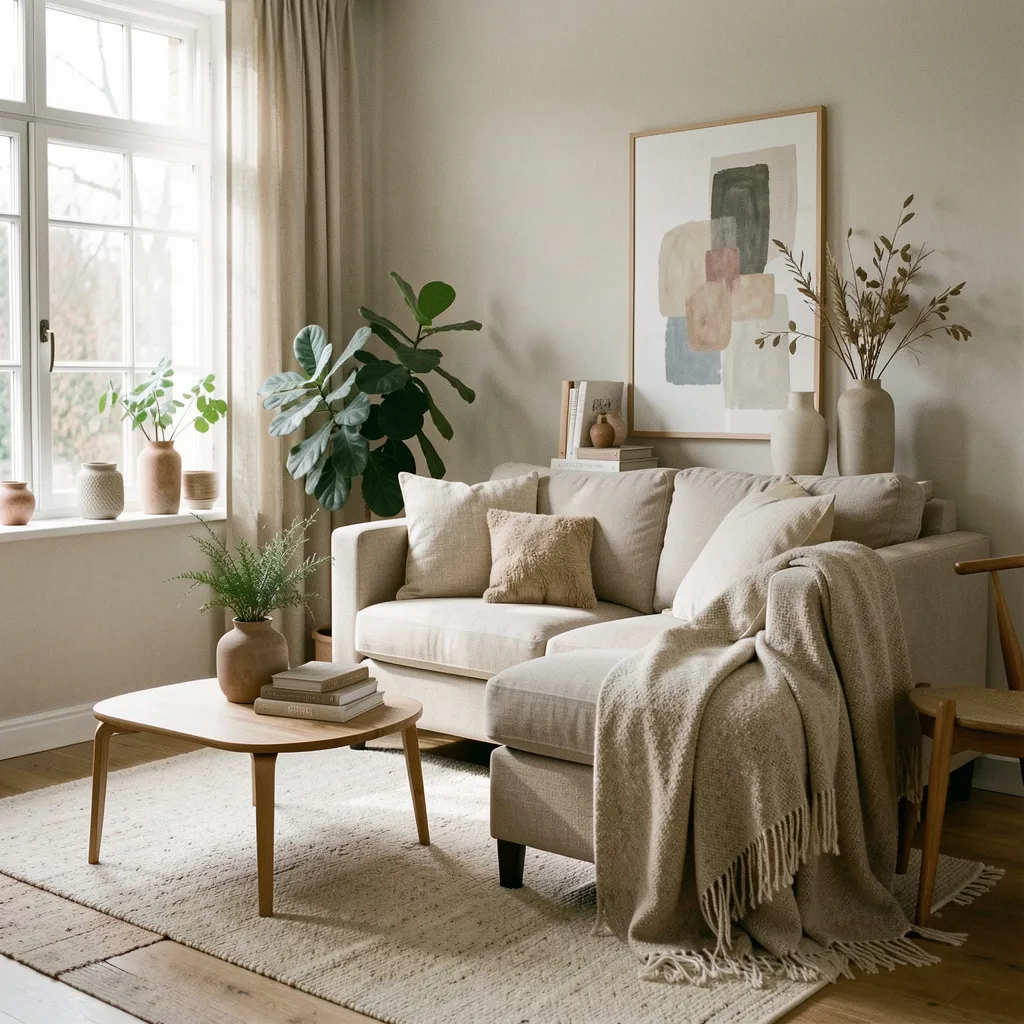
Residential Spaces
Create harmonious living environments where color supports daily activities, enhances comfort, and reflects personal aesthetic preferences.
Commercial Environments
Design color schemes that align with brand objectives, support user experience, and create memorable spatial experiences.
The Chromatic Journey
Analysis Phase
We begin by understanding your context—architectural lighting, existing elements, functional requirements, and desired emotional outcomes.
Development Phase
We analyze undertones, test combinations, and refine until the palette achieves its intended purpose and visual harmony.
Understanding Color Impact
Colors influence perception, behavior, and emotional responses. Our approach is grounded in scientific research on how different hues affect cognitive function, mood regulation, and spatial perception.
Warm Colors
Warm colors like reds, oranges, and yellows stimulate energy and promote social interaction. They are effective for dining areas and gathering spaces.
Cool Colors
Cool colors such as blues and cyans promote calmness and focus. They reduce visual fatigue and support extended periods of concentration.
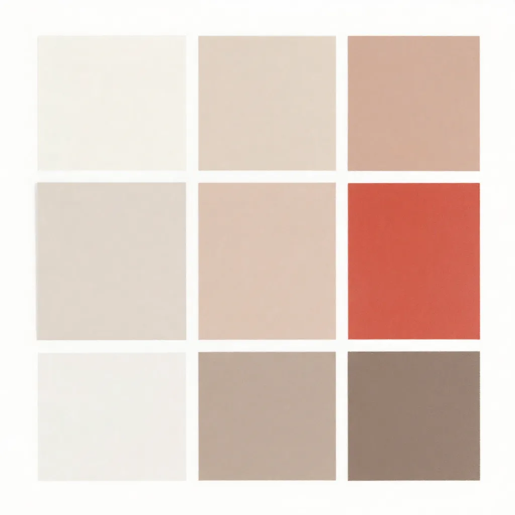
Neutral Colors
Neutral tones provide visual rest and allow other elements to take prominence. They create sophisticated backdrops for functional spaces.
Real-World Applications
Workspace Optimization
Studies indicate that blue and green tones support sustained attention and reduce eye strain during extended work periods. Strategic use of warm accents can stimulate creativity in collaborative areas.
Residential Wellbeing
Bedroom environments benefit from cooler, muted tones that signal the brain to prepare for rest. Living areas can incorporate warmer hues to encourage social interaction and comfort.
Brand Communication
Color associations vary across cultures and contexts. A well-considered palette communicates brand values, differentiates from competitors, and creates memorable visual identities.
Our Approach
Scientific Foundation
Our recommendations are grounded in color theory, psychology research, and accessibility standards. Every decision is informed by established principles.
Contextual Analysis
We consider architectural elements, existing furnishings, brand positioning, and user needs to ensure colors enhance rather than compete with the overall design.
Functional Design
Aesthetic choices must support functional requirements. Colors are selected for their ability to facilitate intended activities and emotional states.
Begin Your Color Journey
Ready to transform your space or brand with intentional color choices? Contact us to schedule your consultation and discover how color can enhance your environment.